Earlier this summer I met with Erin Hatcher, brand manager of Duke’s mayonnaise at the C.F. Sauer Co. in Richmond, who described the habits of several enthusiastic customers. “They make paintings,” she told me. “Paintings of a jar with a sandwich. A lot.”
“Paintings?” I can be heard saying on the recording. Though in a mayonnaise factory, I must have turned three shades of ketchup red, knowing that I was one of those very fans. I had recently penned a small drawing of the Duke’s jar.
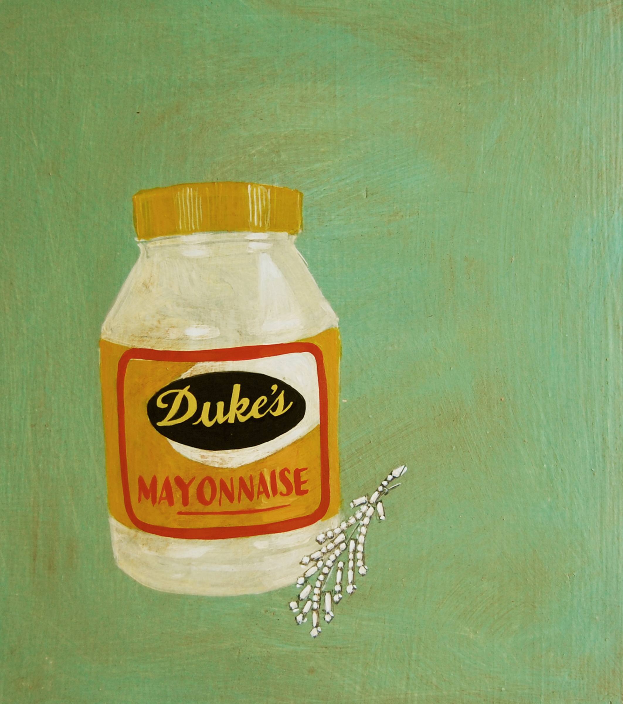
It turns out I’m in good company. The SFA’s own Amy Evans has a painting called “Camille’s Grandmother Loved Duke’s Mayonnaise and Costume Jewelry.”
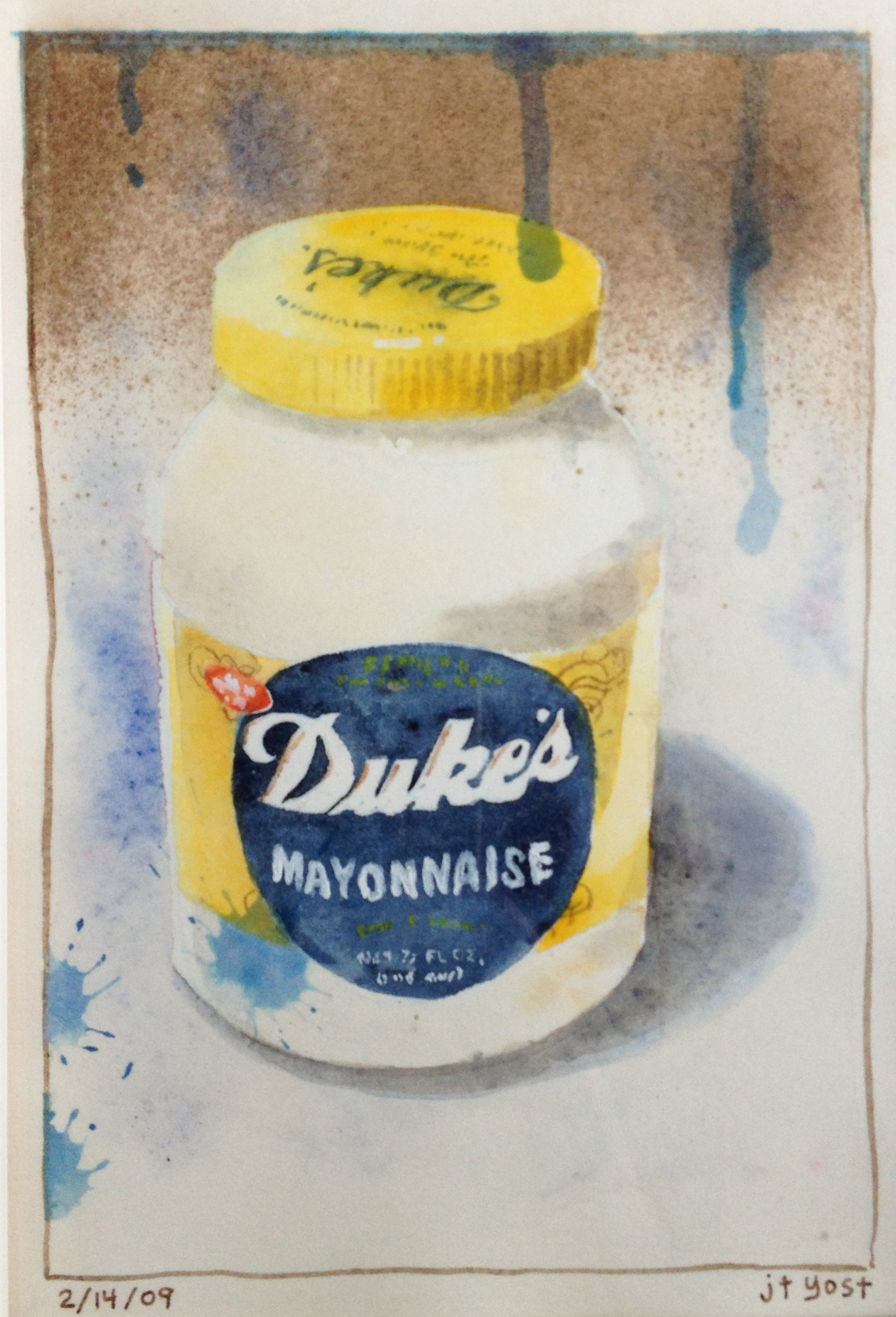
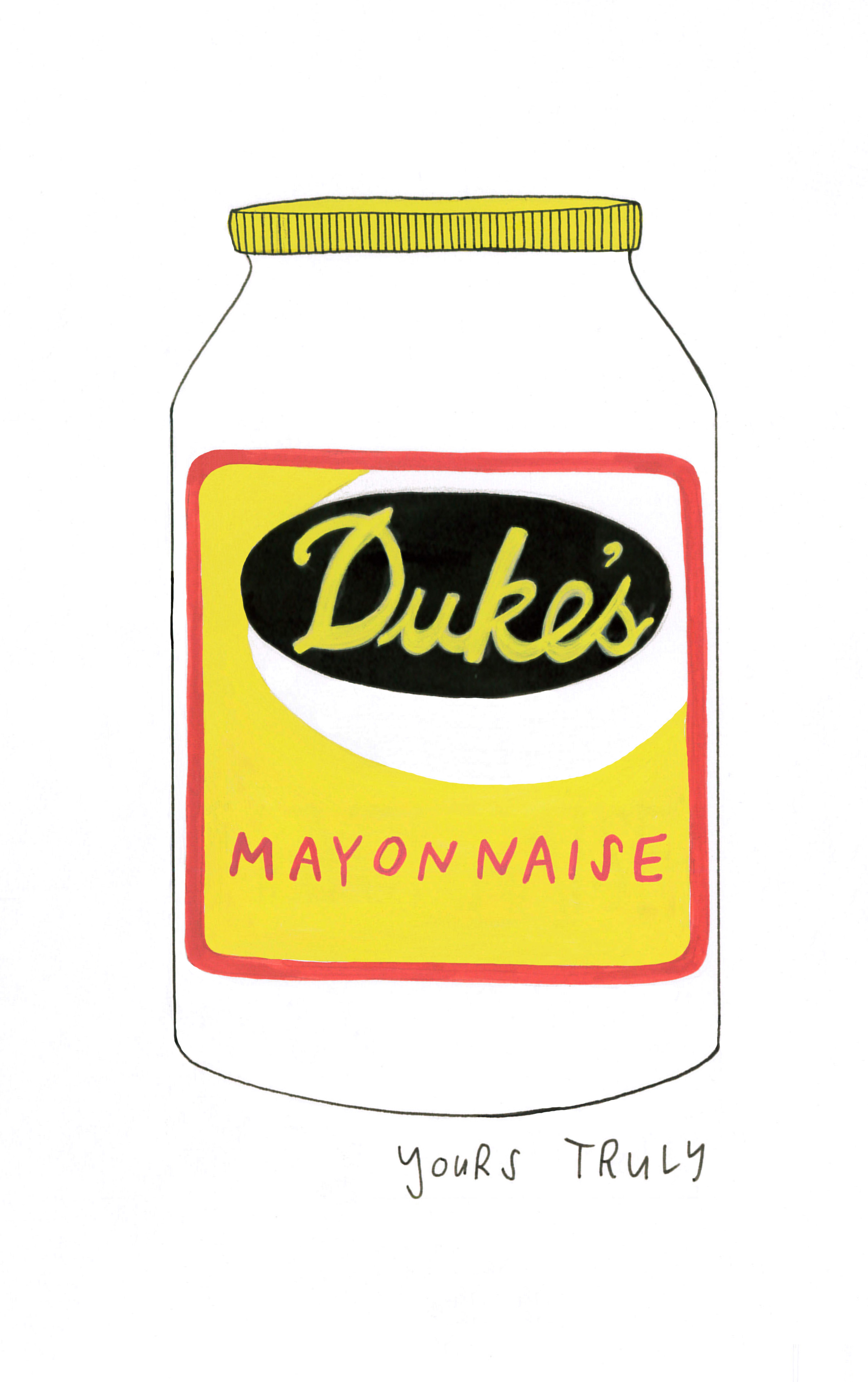
And Nicole Lang, the force behind Boxed Lunch, Pimento Cheese, Please! and several posts on this site, is the proud owner of a Duke’s painting that her husband commissioned from illustrator J.T. Yost.
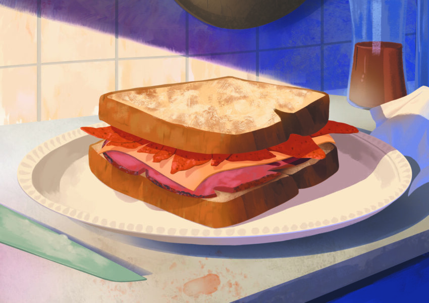
Duke’s paintings just make sense (or so I tell myself). Portraits are common objects among royalty, and what’s more satisfying than the simple black, yellow, and red Duke’s label? Mark Sauer, executive vice president of sales at C.F. Sauer Co., which has manufactured the Duke’s brand since 1929, can think of other things—at least when it comes to some of the design’s earlier iterations. “That label is just ugly as hell,” Sauer told me. “The funniest thing. My uncle Tremaine [Sauer]—he’s color blind, and he did all of our labels.”
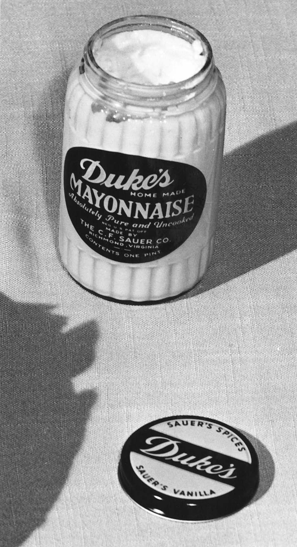
As for today’s slightly tweaked design (which doesn’t include Duke’s former slogan, “Absolutely pure and uncooked”—one of Sauer’s pet peeves), Sauer says, “I think the label is much better now.”
Lots of us would say it’s been great all along. Some of us would paint it. And a few folks would do other things. I’ll share some of those label uses and stories at the SFA symposium in October, when I’ll present on Duke’s founder, Eugenia Duke. Until then! It’s been a pleasure to blog about food, art, and design.